> For the complete documentation index, see [llms.txt](https://mpithemes.gitbook.io/triumph/llms.txt). Markdown versions of documentation pages are available by appending `.md` to page URLs; this page is available as [Markdown](https://mpithemes.gitbook.io/triumph/pages/product-page/details.md).
# Details
Provides additional content blocks to add corresponding information about a product.
{% hint style="success" %}
Add each block by pressing the '**Add block**' to display the desired product details: [Collapsible row](#collapsible-row), [Complementary products](#complementary-products), [Description](#description), [Discount coupon](#discount-coupon), [Icon with text grid](#icon-with-text-grid), [Icon with text rows](#icon-with-text-rows), [Main info](#main-info), [Pickup availability](#pickup-availability), [Security badges](#security-badges), [Shipping and delivery](#shipping-and-delivery), [Tabs](#tabs), and [Variant pickers & Buy](#varian-pickers-and-buy).
{% endhint %}
## Collapsible row
**Heading**\
Enter the tab's title.
**Row content**\
Add the tab's text content.\
(Supports basic formatting like bold, italic, and links).
**Row content from page**
> *To display content from a page, two steps are required:*
>
> 1\. Create a page in *Shopify admin -> Online Store -> Pages*. Read more information in the '[Creating and editing pages](https://help.shopify.com/en/manual/online-store/add-edit-pages)' help page.
>
> 2\. Select the created page in the section.
**Open by default**
* **Enabled** - The section expands when the page loads.
* **Disabled** - Keeps it collapsed until clicked.
***
## Complementary products
{% hint style="warning" icon="alarm-exclamation" %}
**Note!** Displays recommended products (requires using an app).\
Read the '[Customize product recommendations with Shopify Search & Discovery](https://help.shopify.com/en/manual/online-store/storefront-search/search-and-discovery-recommendations)' help page for the details.
**Recommended app:** Search & Discovery app
{% endhint %}
> *Required steps:*
>
> 1\. Install the app.
>
> 2\. Apply settings in *Shopify admin -> Apps -> Search & Discovery app -> Recommendations*.
>
> 3\. Add the block in the section.
>
> 4\. Apply any changes in the block.
**Heading**\
Enter the title for the complementary products.
**Open by default**
* **Enabled** - The section expands when the page loads.
* **Disabled** - Keeps it collapsed until clicked.
**Product count**\
Set the number of recommended products to display in this section (1-10).
***
## Description
{% hint style="warning" icon="alarm-exclamation" %}
**Note!** Displays a product description from the admin.
{% endhint %}
> *Required steps:*
>
> 1\. Add a description to each product in *Shopify admin -> Products*.
>
> 2\. Add the block in the section.
**Heading**\
Enter the title for this block.
**Collapsible row**\
Displays the description in a tab that a customer can expand or collapse.
***
## Discount coupon
**Coupon code**\
Enter the discount code that customers can use at checkout.
**Percentage**\
Sets the discount amount as a percentage (1-99% off).
**Heading**\
The main text used to introduce or highlight the coupon.
**End date**\
Use the field to paste a date when the coupon expires.
#### Colors
**Background**\
Set the coupon code background color.
**Text**\
Controls the color of all text in the coupon code section.
**Accent**\
Adjusts the color of the icon and coupon code.
**Line**\
Accent color of the vertical line separator.
***
## Icon with text grid
**Max columns desktop**\
Set the number of columns in the row (1-4).
### Item
{% hint style="success" %}
Press the '**Add block**' to create and customize each card.\
The block can be added multiple times.
{% endhint %}
**Heading**\
Enter the card's title.
**Content**\
Add the card's text content.\
(Supports basic formatting like bold, italic, and links).
**Icon**\
Choose an icon from the available icon set.
**Image icon**\
Upload a custom image to use as an icon instead of the default one.
**Icon vertical alignment**\
Controls how the icon is aligned next to the content:
* **Top** – Aligns the icon with the top of the text.
* **Center** – Centers the icon vertically relative to the text.
***
## Icon with text rows
### Item
{% hint style="success" %}
Press the '**Add block**' to create and customize each row.\
The block can be added multiple times.
{% endhint %}
**Content**\
Add the text or information you want to display for this item.\
(Supports basic formatting like bold, italic, and links).
**Show icon**\
Turn this on to display an icon next to the content.
**Icon**\
Choose an icon from the available icon set.
**Image icon**\
Upload a custom image to use as an icon instead of the default one.
**Icon vertical alignment**\
Controls how the icon is aligned next to the content:
* **Top** – Aligns the icon with the top of the text.
* **Center** – Centers the icon vertically relative to the text.
***
## Main info
{% hint style="success" %}
Includes [Announcement](#announcement), [Attributes](#attributes), [Title](#title), [Product rating](#product-rating), [Badges](#badges), [Price](#price), [Product inventory](#product-inventory), and [Question form](#question-form).
{% endhint %}
### Announcement
**Text**\
Add a message to highlight promotions or important information.
**Source**\
Select where to display a countdown:
* **Block** - Displays settings from the current block.
**Timer mode**\
Choose how the countdown works:
* **Recurring**\
Repeats automatically based on a schedule. Select in the '**Period**':
* Every 30 minutes (at :00 and :30)
* Every hour (at :00)
* Daily (at midnight)
* Weekly (Sunday midnight)
* Monthly (1st day)
* Yearly (Jan 1st)
* **Fixed end date**\
Set a specific end date and time:
* Year
* Month
* Day
* Hour
* Minute
* **Metafield** - Sets the countdown using a metafield.\
*Note: This feature requires configuring additional settings in the admin. Read the details* [*here*](/triumph/customizable-features/countdown.md)*.*
#### Colors
**Text**\
Sets the color of the title.
**Countdown background**\
Changes the countdown background color.
**Countdown text**\
Controls the color of the numbers and labels inside the countdown.
***
### Attributes
> *Required steps:*
>
> 1\. Add attributes to each product in *Shopify admin -> Products*.
>
> 2\. Use the block's settings.
Choose which details to show below the product image:
* SKU
* Type
* Vendor
***
### Title
{% hint style="success" %}
Displays a product title from the admin.
{% endhint %}
**Font size**\
Controls how large the title appears on desktop screens (20-54).
**Mobile font size**\
Adjusts the title size specifically for mobile devices (20-34).
**Uppercase**\
Displays product titles in all capital letters.
***
### Product rating
***
### Badges
**Sale**\
Show a sale badge.
> This option requires adding the comparison price for each product or product variants in *Shopify admin -> Products*.
**Sale badge type**\
Choose how discounts are displayed:
* **Text** - Shows a simple label as the sale text.
* **Discount percent** - Converts text to the discount percentage.
* **Saved amount** - In addition to the text, display additional details, such as the amount.
**Pre-order**\
Tags products available for pre-order.
> The feature requires additional settings applied in *Shopify admin -> Products*:
>
> 1.
**Out of stock**\
Labels unavailable products and disables the '*Add to Cart*' button to prevent orders.
***
### Price
**Font size**\
Controls how large the price appears on desktop screens (20-40).
**Mobile font size**\
Adjusts the title size specifically for mobile devices (20-34).
**Tax information**\
Shows additional details about taxes (for example, whether taxes are included or calculated at checkout).
**Shipping policy**\
Provides a link or information concerning delivery terms, such as delivery times and costs.
***
### Product inventory
Displays product stock availability information to customers.
**Low stock threshold**\
Set the inventory level that triggers a low stock message (1-100):
* **Inventory above the number** - Displays the '*In stock*' text.
* **Inventory below the number** - Shows the '*Low stock*' warning.
**Show quantity for low stock**\
Displays the exact number of items remaining when stock is low.
***
### Question form
**Link text**\
The clickable text that opens the question form (for example, 'Ask a question').
**Popup content**\
The title displayed in the pop-up when the form is opened.
***
## Pickup availability
{% hint style="warning" icon="alarm-exclamation" %}
**Note!** This feature requires additional settings in the Shopify admin.\
Read the '[Managing pickup in store orders in Shopify POS](https://help.shopify.com/en/manual/sell-in-person/shopify-pos/order-management/pickup-in-store-for-online-orders)' help page.
{% endhint %}
***
## Security badges
Displays trust or payment badges to help reassure customers during shopping and checkout.
**Heading**\
Enter a title for the security badges section.
**Default payments icons**
* **Enabled** - Automatically displays payment method icons based on your store’s payment settings.
> Set up payment methods in *Shopify admin -> Settings -> Payments*.
* **Disabled** - Shows custom icons using the [Badge](#badge) block.
**Badge height**\
Controls the displayed height of the badges and payment icons (30-60 px).
***
### Badge
{% hint style="success" %}
Add the block for each new payment icon.
{% endhint %}
**Icon**\
Choose an icon from the available icon set.
**Image icon**\
Upload a custom image to use as an icon instead of the default one.
***
## Shipping and Delivery
{% hint style="success" %}
Use the [*Free shipping*](#free-shipping) and [*Delivery estimate*](#delivery-estimate) to customize the bars*.*
{% endhint %}
***
### Free shipping
> Configure the Free shipping in *Theme settings ->* [*Free shipping*](/triumph/theme-settings/theme-settings.md#free-shipping).
***
### Delivery estimate
Displays an estimated delivery date for customer orders.
**Delivery time (days)**\
Set the average number of days required for delivery (1-100).
**Cutoff hour (24h format)**\
Set the daily order cutoff time using a 24-hour format (0-23).\
*Note: Orders placed after this time will be processed on the next business day.*
**Date format**\
Controls how the estimated delivery date is displayed.\
Use the following format options:
* **day** – weekday name
* **dd** – day number
* **mm** – month number
* **yyyy** – full year
* **yy** – short year
**Example:** Monday, 22/07/2026
**Time format**\
Choose how the delivery timer is displayed:
* **Full** – Shows the complete timer format.
* **Short** – Displays a simplified version.
#### Skip delivery days
Select days that should not be counted as delivery days.\
Available options:
* Sunday
* Monday
* Tuesday
* Wednesday
* Thursday
* Friday
* Saturday
***
## Tabs
{% hint style="success" %}
Build tabs using the [*Description*](#description-1) and [*Tab*](#tab).
{% endhint %}
***
### Description
Use the block to display a product description in the tab.
{% hint style="warning" icon="alarm-exclamation" %}
**Note!** Displays a product description from the admin.
{% endhint %}
> *Required steps:*
>
> 1\. Add a description to each product in *Shopify admin -> Products*.
>
> 2\. Add the block in the section.
***
### Tab
**Heading**\
Enter the tab's title.
**Content**\
Add the tab's text content.\
(Supports basic formatting like bold, italic, and links).
**Page**
> *To display content from a page, two steps are required:*
>
> 1\. Create a page in *Shopify admin -> Online Store -> Pages*. Read more information in the '[Creating and editing pages](https://help.shopify.com/en/manual/online-store/add-edit-pages)' help page.
>
> 2\. Select the created page in the section.
***
## Varian pickers & Buy
{% hint style="success" %}
Contains [Variant picker](#variant-picker), [Size guide](#size-guide), and [Buy buttons](#buy-buttons).
{% endhint %}
**Restrict form width**\
Limits how wide the product form appears.
**Form width**\
Sets the form width (700-800 px).
### Variant picker
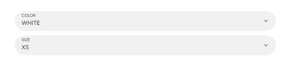
**Style**\
Changes the design of product variants:
* **Dropdowns**
* **Pills**
#### Text swatches
**Fixed number per row**\
Keeps a consistent number of variants in each row.
**Per row on desktop**\
Sets the number of variants in one row on desktop screens (4-12).
**Per row on tablet and mobile**\
Controls the number of variants per row on smaller screens such as tablets and phones (2-5).
#### Color swatches
> Available when '*Pills*' is selected.
**Type**\
Choose how swatches appear:
* **Color swatch**

* **Variant image**

* **Text**

**Per row on desktop** (*only 'Variant image' and 'Text' types*)\
Sets the number of color variants in one row on desktop screens (4-12).
**Image ratio** *(only 'Variant image' type)*\
Set the image style:
* **Default** – Uses the configurations from *Theme settings ->* [*Product card*](/triumph/theme-settings/theme-settings.md#product-card).
* **Adapt to first image** – Uses the default proportions of the first image.
* **Adapt to image** – Keeps each image’s original proportions.
* **Squared** – Displays images in a 1:1 ratio.
* **Portrait** – Taller images (3:4 ratio).
* **Landscape** – Wider images (4:3 ratio).
***
### Size guide
**Link text**\
The clickable text opens the size guide.\
**Example:** 'Size guide'
**Popup heading**\
The title is displayed at the top of the size guide pop-up.
**Popup content source page**\
Select a page from your store to automatically display its content in the pop-up.
> Create a page in *Shopify admin -> Online Store -> Pages*.
>
> Read '[Creating and editing pages](https://help.shopify.com/en/manual/online-store/add-edit-pages)' article for the details.
***
### Buy buttons
**Show quantity selector**\
Allows customers to choose how many items to add to the cart.
**Show price on button**\
Displays the product price directly on the '*Add to Cart*' button.
**Dynamic checkout buttons**\
Shows fast checkout options based on the customer’s preferred payment method.
> The payment methods depend on several factors.
>
> Read the '[Accelarated checkout buttons](https://help.shopify.com/en/manual/online-store/dynamic-checkout)' article for the details.
**Gift card sending options**\
Lets customers send gift cards to someone else, add a personal message, and choose a delivery date.
> Read the '[Add recipient fields to your gift card products](https://help.shopify.com/en/manual/online-store/themes/customizing-themes/common-customizations/add-gift-card-recipient-fields)' article.
**Sticky add to cart button**\
Displays a fixed purchase button that stays visible while scrolling through the product page.
**Sticky button action**\
Choose what happens when the sticky button is clicked:
* **Add to cart** – Immediately adds the product to the cart.
* **Scroll to form** – Scrolls the page to the main product purchase form.
#### Button 'Add to cart' colors
**Background**\
Sets the button background color.
**Background gradient**\
Applies a gradient background to the button.
**Border**\
Controls the button's border color.
**Text**\
Sets the button text color.
**Hover background**\
Changes the background color on hover.
**Hover background gradient**\
Applies a gradient background on hover.
**Hover border**\
Changes the border color on hover.
**Hover text**\
Changes the text color on hover.
#### Button 'Buy it now' colors
**Background**\
Sets the background color of the '*Buy it now*' button.
**Background gradient**\
Applies a gradient background.
**Text**\
Sets the text color.
**Hover background**\
Changes the background color on hover.
**Hover background gradient**\
Applies a gradient on hover.
**Hover text**\
Changes the text color on hover.
---
# Agent Instructions
This documentation is published with GitBook. GitBook is the documentation platform designed so that both humans and AI agents can read, navigate, and reason over technical content effectively. Learn more at gitbook.com.
## Querying This Documentation
If you need additional information that is not directly available in this page, you can query the documentation dynamically by asking a question.
Perform an HTTP GET request on the current page URL with the `ask` query parameter, and the optional `goal` query parameter:
```
GET https://mpithemes.gitbook.io/triumph/pages/product-page/details.md?ask=&goal=
```
`ask` is the immediate question: it should be specific, self-contained, and written in natural language.
`goal` is optional and describes the broader end goal you are ultimately trying to accomplish on behalf of the user. GitBook uses it to tailor the answer towards what is most useful for that goal.
The response will contain a direct answer to the question and relevant excerpts and sources from the documentation.
Use this mechanism when the answer is not explicitly present in the current page, you need clarification or additional context, or you want to retrieve related documentation sections.