> For the complete documentation index, see [llms.txt](https://mpithemes.gitbook.io/unicorn-shopify-theme/llms.txt). Markdown versions of documentation pages are available by appending `.md` to page URLs; this page is available as [Markdown](https://mpithemes.gitbook.io/unicorn-shopify-theme/dynamic-theme-sections/collection-collage.md).
# Collection collage
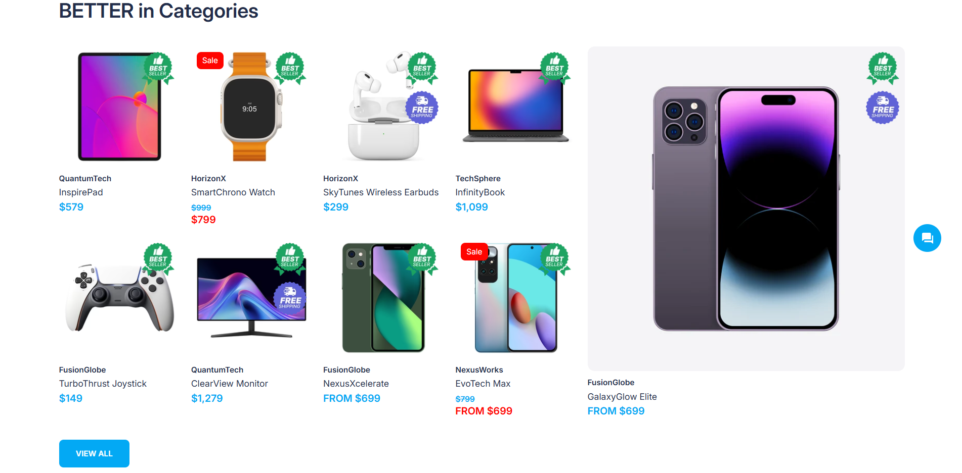
Use the section to spotlight a chosen product or highlight a promotion by positioning it in a distinct area alongside the predefined collection.
{% hint style="success" %}
This section contains the "[Header](/unicorn-shopify-theme/dynamic-theme-sections/blocks/header.md)", "[Collection](/unicorn-shopify-theme/dynamic-theme-sections/collection-collage.md#content)"\*, "[Product](/unicorn-shopify-theme/dynamic-theme-sections/collection-collage/product.md)"\*, and "[Promotion](/unicorn-shopify-theme/dynamic-theme-sections/blocks/promotion.md)" blocks.\
**Tip:** Press **"Add block"** to use the desired block. The "Collection", "Products", and "Promotion" blocks can be added individually and customized in different ways.\
\***Note!** Only **one** additional block ("Products" or "Promotion") can be displayed in this section. To add a new block, first remove the default block by clicking the trash icon next to its name.
{% endhint %}
### Collection
**Collection**\
Set the required collection by pressing the **"Select"** button.
**Use recently viewed products**\
If the option is enabled, the current collection will be replaced with products that the visitor has recently viewed.
**Products per row**\
The number of products displayed per row can be set between 2 and 6.
### Layout options
{% hint style="success" %}
Check the layout option examples [here](/unicorn-shopify-theme/dynamic-theme-sections.md#layout-options).
{% endhint %}
The layout settings change the look and feel of the section.
**Layout**\
Change the "[Header](/unicorn-shopify-theme/dynamic-theme-sections/blocks/header.md)" content group position using the picker:
* **"Stacked"**. Displays title elements above the media content and aligns them to the left.
* **"Centered"**. Shows the centered title elements above the media content.
**Mobile alignment**\
Align the elements from the "[Header](/unicorn-shopify-theme/dynamic-theme-sections/blocks/header.md)" content group using one of the options:
* **"Auto"**. Uses the setting applied in the "Layout".
* **"Left"**. Displays content on the left.\ **Note!** The call-to-action button displays in full width on mobile by default.
* **"Center"**. Centers content.\ **Note!** The call-to-action button displays in full width on mobile by default.
**Dividing line**\
Add a divider by setting its position: "Top", "Bottom", or "Both". Select "None" to hide the divider.
**Top spacing /** **Bottom spacing**\
Decide whether to add spaces at the top and bottom of the section. Control spacing settings from 0 to 100 pixels on each scale.
### Transparent header
Allows the header to overlay the section when a transparent header is used.
**Use inverted header colors**\
Enable the option to link the color of the Header elements, such as navigation menus, Search, Compare, Account, and Cart icons, with the "[Background](/unicorn-shopify-theme/theme-settings/colors.md#background)" item under *Theme settings -> Colors -> Primary colors*. If the option is disabled, the color of the Header elements is related to the "[Base](/unicorn-shopify-theme/theme-settings/colors.md#base)" item.
{% tabs %}
{% tab title="Desktop" %}
{% endtab %}
{% tab title="Mobile" %}
{% endtab %}
{% endtabs %}