> For the complete documentation index, see [llms.txt](https://mpithemes.gitbook.io/unicorn-shopify-theme/llms.txt). Markdown versions of documentation pages are available by appending `.md` to page URLs; this page is available as [Markdown](https://mpithemes.gitbook.io/unicorn-shopify-theme/dynamic-theme-sections/scrolling-text.md).
# Scrolling text
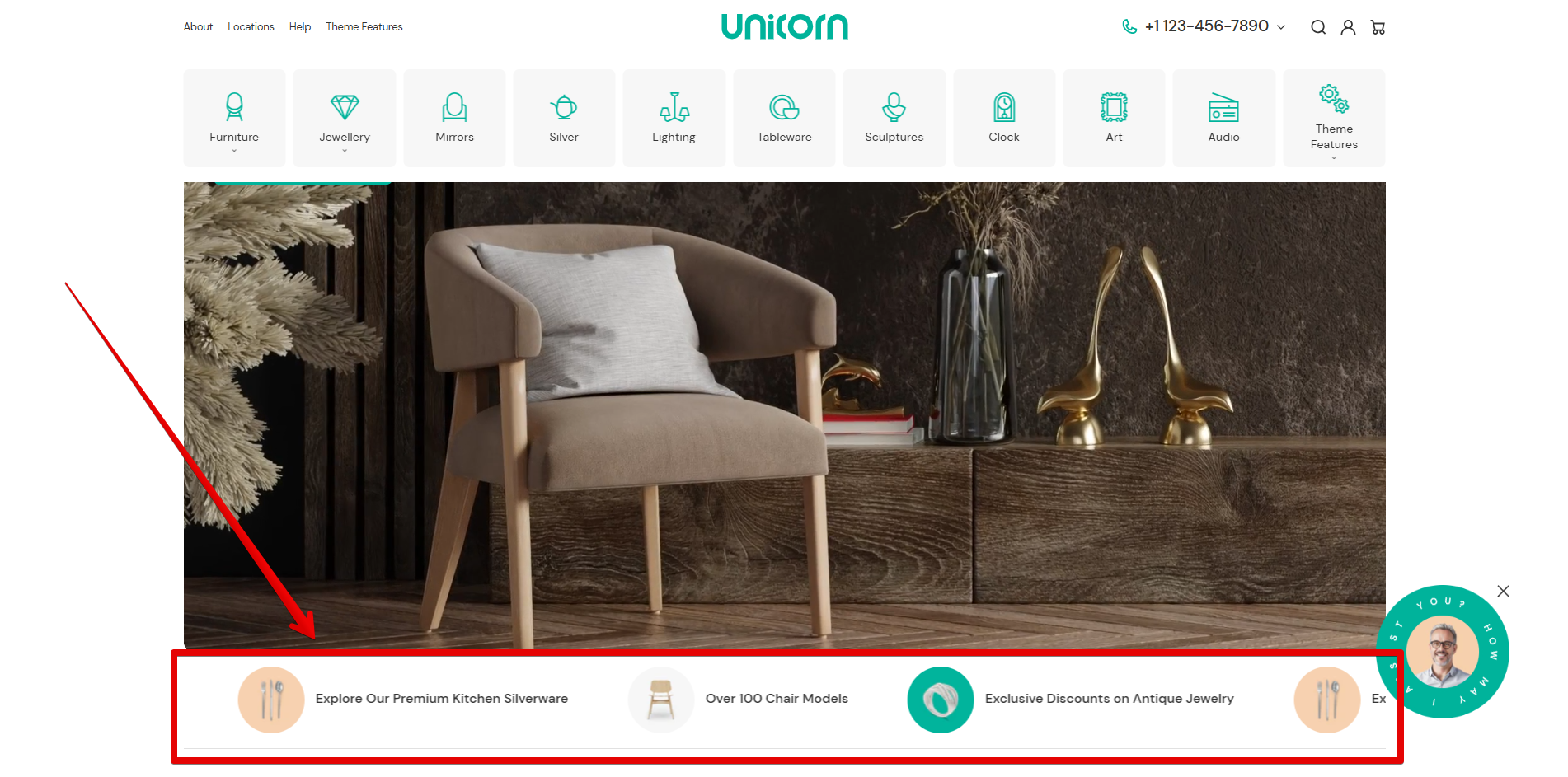
The "Scrolling text" section is an informative line that allows you to display brief and catchy text with media content.
## Scrolling text
{% hint style="success" %}
This section contains the "[Scrolling item](#scrolling-item)" block.\
**Tip:** Press **"Add block"** to use the block. Each block can be added individually and customized in different ways.
{% endhint %}
### Content
**Media width**\
Use the scale to set the media size. The parameters can be changed from 20 to 200 pixels. This setting works for an image and SVG icon applied in the "[Scrolling item](#scrolling-item)" block.
**Separator**\
Using the provided field, you can either add the built-in theme SVG icon, your custom icon, or any symbol:
* To display the built-in theme graphics, add an icon name to the field. Learn how to use the theme SVG icons [here](/unicorn-shopify-theme/svg-icons.md#built-in-theme-svg-icons).
* Use the provided field to paste the HTML code of your custom SVG icon. Refer to the following [help page](/unicorn-shopify-theme/svg-icons.md#integrate-custom-svg-icons-into-the-theme) for step-by-step instructions on the required modifications.
* To place a simple separator, such as an asterisk "✲", type a symbol in the field.\*\
\*The field works with symbols, letters, and numbers.
* To hide a separator, leave the field blank.
**Speed**\
Use the slider to adjust the running line speed in seconds from 1 to 5.
### Layout options
**Full width**\
Activate the option to display content across the entire width of the page. Otherwise, it appears within the standard content page width.
**Dividing line**\
Add a divider by setting its position: "Top", "Bottom", or "Both". Select "None" to hide the divider.
**Top spacing /** **Bottom spacing**\
Decide whether to add spaces at the top and bottom of the section. Control spacing settings from 0 to 100 pixels on each scale.
### Colors
**Text**\
Use the color picker to set the information line color.
**Icon**\
The item changes the color of the SVG icon arranged in the "[Scrolling item](#scrolling-item)" block.
**Separator**\
Switches the symbol / SVG icon color added in the corresponding field of the current section.
### Transparent header
Allows the header to overlay the section when a transparent header is used.
**Use inverted header colors**\
Enable the option to link the color of the Header elements, such as navigation menus, Search, Compare, Account, and Cart icons, with the "[Background](/unicorn-shopify-theme/theme-settings/colors.md#background)" item under *Theme settings -> Colors -> Primary colors*. If the option is disabled, the color of the Header elements is related to the "[Base](/unicorn-shopify-theme/theme-settings/colors.md#base)" item.
***
## Scrolling item
{% hint style="success" %}
**Tip:** Add as many blocks as needed to display multiple announcement lines.
{% endhint %}
**Link**\
Use the source selector to assign a page or add an external link to the field to redirect visitors to the desired page by clicking the text.\ **Note!** Once the link is specified, the underline effect is activated on the desktop when the mouse hovers over the text.
**Open in new tab**\
When enabled, the linked page opens in a new browser tab, allowing customers to keep their current page open while viewing the linked content.
{% hint style="warning" %}
**Note!** Use the image or icon settings to add media. Images and SVG icons can work in cooperation.
{% endhint %}
**Image**\
Connect an image using the source selector. An Image can be added from the store library or uploaded from your device.
**Icon SVG**\
The field is designed to link SVG icons that come with the theme or paste HTML to display a custom SVG icon:
* To display the built-in theme graphics, add an icon name to the field. Learn how to use the theme SVG icons [here](/unicorn-shopify-theme/svg-icons.md#built-in-theme-svg-icons).
* Use the provided field to paste the HTML code of your custom SVG icon. Refer to the following [help page](/unicorn-shopify-theme/svg-icons.md#integrate-custom-svg-icons-into-the-theme) for step-by-step instructions on the required modifications.
* Leave the field blank to hide an icon.
**Text**\
Use the input field to highlight key messages, promotions, or featured content.\
Style your text using the formatting options at the top of the input field.