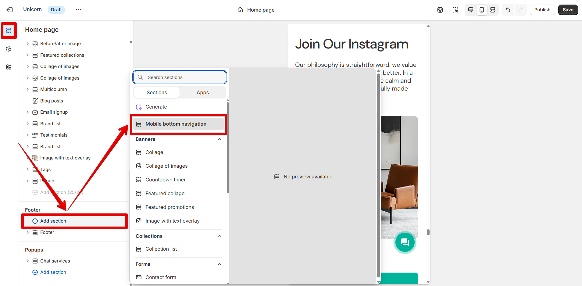
# Mobile bottom navigation
{% hint style="warning" %}
**Note!** This section can be added under the **"Footer"** section group by pressing the **"Add section"** button.
{% endhint %}
## Mobile bottom navigation
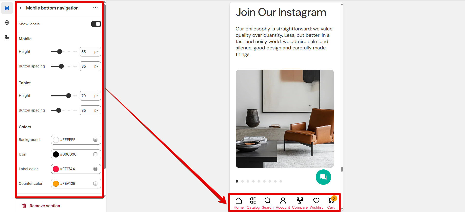
Use the **"Show labels"** option to display the titles of the buttons.
#### Mobile
Apply settings on the following scales individually for mobile:
Use the **"Height"** scale from 45 to 80 pixels to adjust the navigation bar height.
The **"Button spacing"** scale changes the spaces between buttons from 20 to 60 pixels.
#### Tablet
Use the settings described below to apply changes to tablets:
The **"Height"** scale helps adapt the navigation bar height from 45 to 80 pixels.
The spacing between buttons can be adjusted from 20 to 80 pixels on the **"Button spacing"** scale.
#### Colors
In the **"Background"** picker, specify the desired color to highlight the navigation bar.
The **"Icon"** item changes the color of various icons in the bar.
Use the **"Label color"** picker to set the title's color.
The **"Counter color"** item changes the color of the product number added to the cart.
***
{% hint style="success" %}
**Tip:** Add each icon individually by pressing the **"Add block"** button. The icons will be placed in the same order as the blocks added in the control panel on the left side of the screen.
{% endhint %}
### Home
Add the block to display the "Home" icon.
The icon can be linked to a specific page using the **"Link"** source selector.
### Catalog
Add the current block to display the "Catalog" icon.
Paste an external link or search for a page in the **"Link"** source selector.
To open a page in a new tab after pressing the icons, activate the **"Open in new tab"** option.
### Search
Display the "Search" icon in the navigation bar by adding the block.
By default, the Search pop-up appears on the right side of the screen after a visitor clicks the icon. Enable the **"Open in new tab"** option to navigate a customer to the Search page and open it in a new browser tab after the Search icon is clicked.
### Account
Set the "Account" icon to the bar using the block.
When the **"Open in new tab"** option is enabled, clicking an icon opens the page in a new browser tab.
### Compare
This block sets the "Compare" icon in the bar.
The **"Open in new tab"** option allows you to show the page in a new browser tab when you click the icon.
### Favorites
By adding the block, the "Favorites" icon appears in the navigation bar.
When the **"Open in new tab"** option is enabled, clicking an icon opens the page in a new browser tab.
### Cart
Add the block to place the "Cart" icon in the bar.
By default, the Cart pop-up appears on the right side of the screen after a visitor clicks the icon. To open a page in a new tab after pressing the icons, activate the **"Open in new tab"** option.