> For the complete documentation index, see [llms.txt](https://mpithemes.gitbook.io/unicorn-shopify-theme/llms.txt). Markdown versions of documentation pages are available by appending `.md` to page URLs; this page is available as [Markdown](https://mpithemes.gitbook.io/unicorn-shopify-theme/theme-settings/badges.md).
# Badges
Use various badges built into the theme to highlight specific product features.
**Discount**\
Change the background color of the "Sale" badge and "[Countdown timer](/unicorn-shopify-theme/theme-settings/countdown-timer.md)" using the color picker.\ **Note!** By combining the discount badge with the countdown and specifying the color in the "Countdown timer" global section, the countdown settings take priority, and the color applied in the current section won't appear for the badge.
**Show Pre-order**\
Activates the "Pre-order" badge for product cards and on product pages. Additionally, this option requires activating the "Pre-order" functionality in *Theme settings ->* [*Products*](/unicorn-shopify-theme/theme-settings/products.md). Read the details regarding the badge configurations [here](/unicorn-shopify-theme/theme-settings/products.md#required-admin-settings).
***
### Product cards
{% hint style="info" %}
Set up settings per individual products in *Shopify admin -> Products* to make various badges appear throughout your store.
{% endhint %}
**Show discount badge**\
Enable the option to show the "Sale" badge on product cards.
\
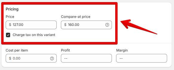
The badge appears for products/product variants with a comparison price set in your admin.
**Show sold-out badge**\
Activate the option to display the "Sold out" badge on product cards.\
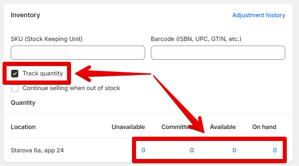
The badge is displayed for products with 0 quantity and inventory tracking enabled in your admin.
***
### Custom badges on product cards
**Position**\
Change the badge placement on product cards to "Top right", "Bottom right", or "Bottom left". These settings work on all screen sizes, so ensure they work as expected with your theme configurations.
**Width**\
Resize badges from 30 to 150 pixels using the scale.
\
This option only works on large screens.
***
### Custom badges on product pages
**Position**\
Control the placement of badges over the main image in the product gallery. Choose from the following options: “Top left,” “Top right,” “Bottom right,” or “Bottom left”.
\
Since this setting applies across all screen sizes, preview it on various devices to ensure badges display as expected.
**Width**\
The option sets the badge size on product pages. Use the scale to fix the size from 30 to 200 pixels. The parameters are applied to the desktop.
***
### Custom badges
{% hint style="success" %}
The examples of custom badges on the Collection and Product pages can be viewed in the [DEMO](https://unicorn-theme-valuable.mpthemes.net/collections/all?page=2).
{% endhint %}
Use settings in the current section to configure custom badges on product cards and product pages for a specific product. Custom images can be configured in the theme using Metafileds. Check out the following [documentation](/unicorn-shopify-theme/faq/how-to-customize-metafields.md#custom-badges) to learn how to create custom badges in the admin using Metafields.\
You can either manage the theme badges or upload your images to the Theme Editor.
The Unicorn provides eight built-in theme badges.\
Here is an example of the Theme badges:
**First - Fourth**\
To display badges from images, press the **"Select"** button in the picker and specify one from the Store library or upload it from your device.\
Each image corresponds to the Metafield built in your admin.\
Example: First badge = custom\_badge\_1, Second badge = custom\_badge\_2, and so on.