# Ticker
## Ticker
### Content
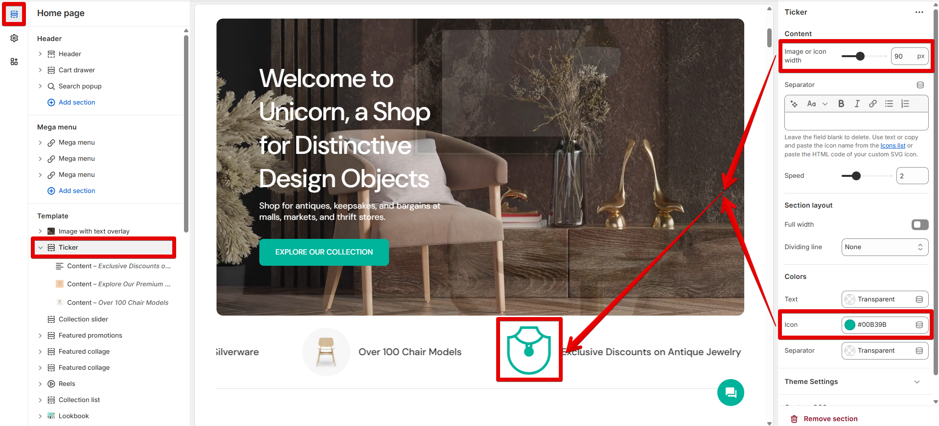
Decide the animation size on the **"Image or icon width"** scale. The parameters can be changed from 20 to 200 pixels. This setting works for an image and icon specified in the [content block](#content-1).
**Separator**
Using the provided field, you can either add the built-in theme SVG icon, your custom icon, or any symbol:
* To display the built-in theme graphic, enter an icon name in the field. Learn how to operate the theme SVG icons [here](https://mpithemes.gitbook.io/unicorn-shopify-theme/icons).
* Use the provided field to paste the HTML code of your custom SVG icon. Refer to the following [help page](https://mpithemes.gitbook.io/unicorn-shopify-theme/svg-icons#integrate-custom-svg-icons-into-the-theme) for step-by-step instructions on the required modifications.
* If you need to place a simple separator, such as an asterisk "✲", type a symbol in the field.
* To hide a separator, leave the field blank.
\*The field works with symbols, letters, and numbers.
Using the **"Speed"** slider, you can adjust the running line speed in seconds from 1 to 5.
### Section layout
Activate the **"Full width"** option to display the ticker across the entire width of the page. Otherwise, the ticker will appear within the standard content width of a page.
Decide on the position of the divider using the "Top", "Bottom", or "Both" options in the **"Dividing line"** drop-down. It will be hidden once you use the "None" option.
### Colors
Use the **"Text"** color picker to adjust the color of the information line.
The **"Icon"** item changes the color of the SVG icon specified in the content block.
The **"Separator"** picker switches the content color added to the corresponding field in the current section.
### Transparent header
The provided setting is applied to the "[Header - transparent](https://mpithemes.gitbook.io/unicorn-shopify-theme/theme-settings/advanced-settings)" feature.
Enable the **"Invert header colors"** to link the color of the Header elements, such as navigation menus, Search, Compare, Favourites, Account, and Cart icons, to the "[Background](https://mpithemes.gitbook.io/unicorn-shopify-theme/theme-settings/colors#background)" item under *Theme settings -> Colors -> Primary colors*. If the option is disabled, the color of the Header elements is related to the "[Base](https://mpithemes.gitbook.io/unicorn-shopify-theme/theme-settings/colors#base)" item.
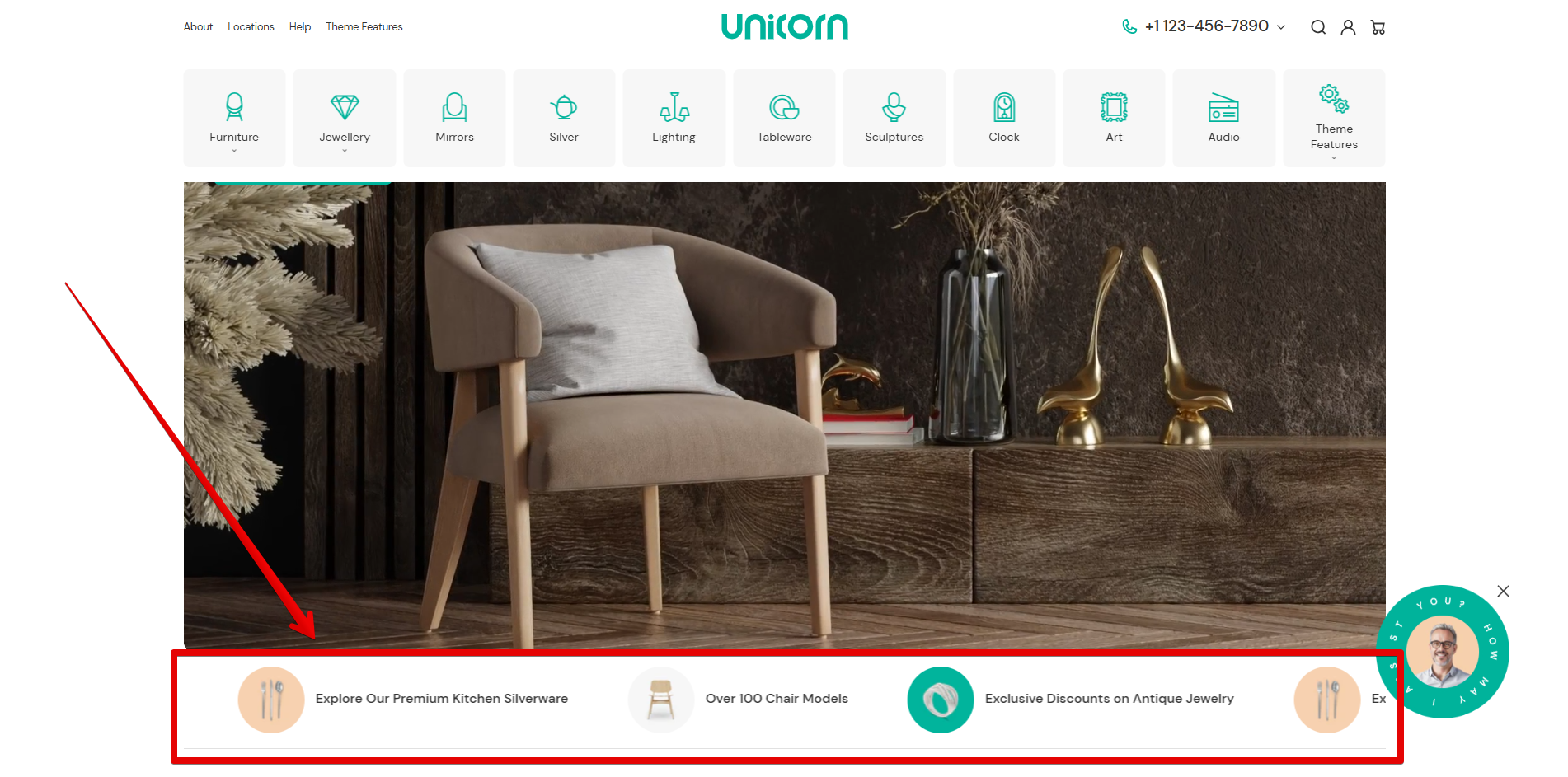
In the following example, you can view how the section might be displayed in a store:
***
## Content
{% hint style="success" %}
**Tip:** Add as many blocks as you need to display several announcement lines in the ticker.
{% endhint %}
Apply the URL from the **"Link"** source selector or add an external link to the field if you need to redirect visitors to the desired page by hitting the text. Once the link is specified, the underline effect will be activated for the desktop when the mouse hovers over the text.
Use the image or icon settings to add an illustration. Images and icons can work in cooperation:
Connect an image using the **"Image"** source selector. Images can be added from the store library or uploaded from your device.
Using the **"Icon SVG"** field, you can either add the built-in theme SVG icon or your custom icon:
* To display the built-in theme graphic, enter an icon name in the field. Learn how to operate the theme SVG icons [here](https://mpithemes.gitbook.io/unicorn-shopify-theme/icons).
* Use the provided field to paste the HTML code of your custom SVG icon. Refer to the following [help page](https://mpithemes.gitbook.io/unicorn-shopify-theme/svg-icons#integrate-custom-svg-icons-into-the-theme) for step-by-step instructions on the required modifications.
* Leave the field blank to hide an icon.
Use the **"Text"** input field to insert informative lines.
An example of the block settings might be viewed below:
