# Cart
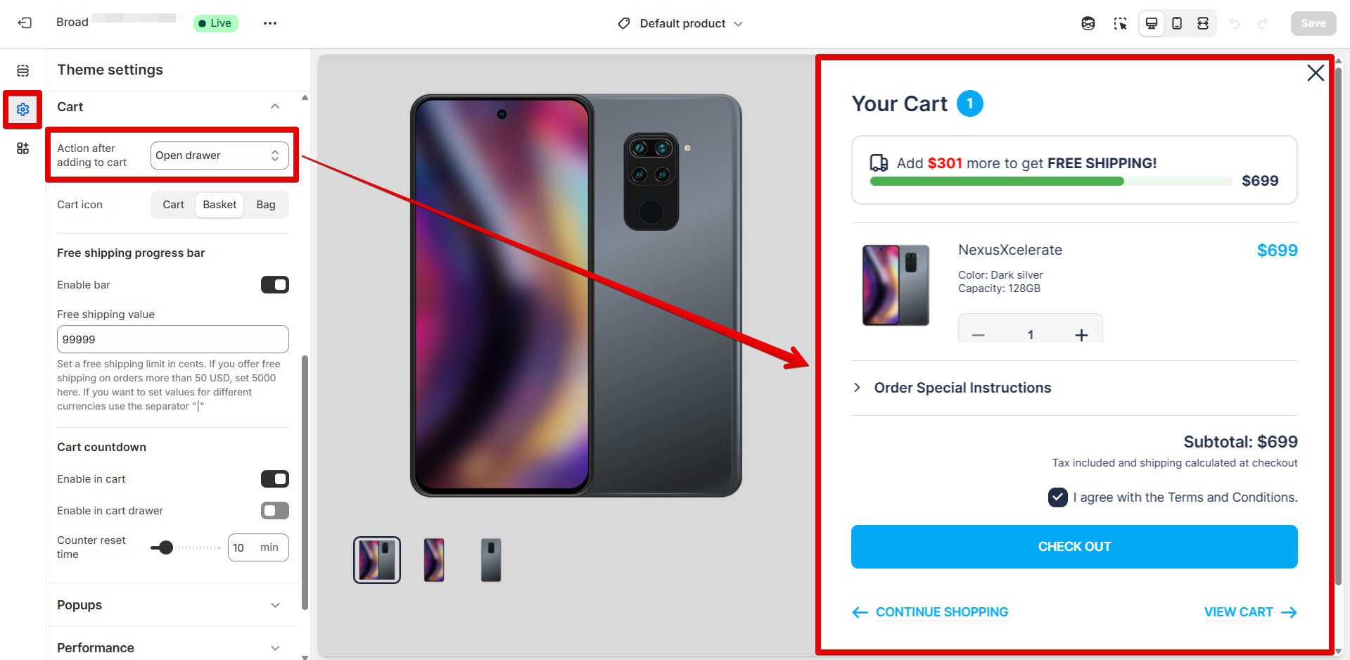
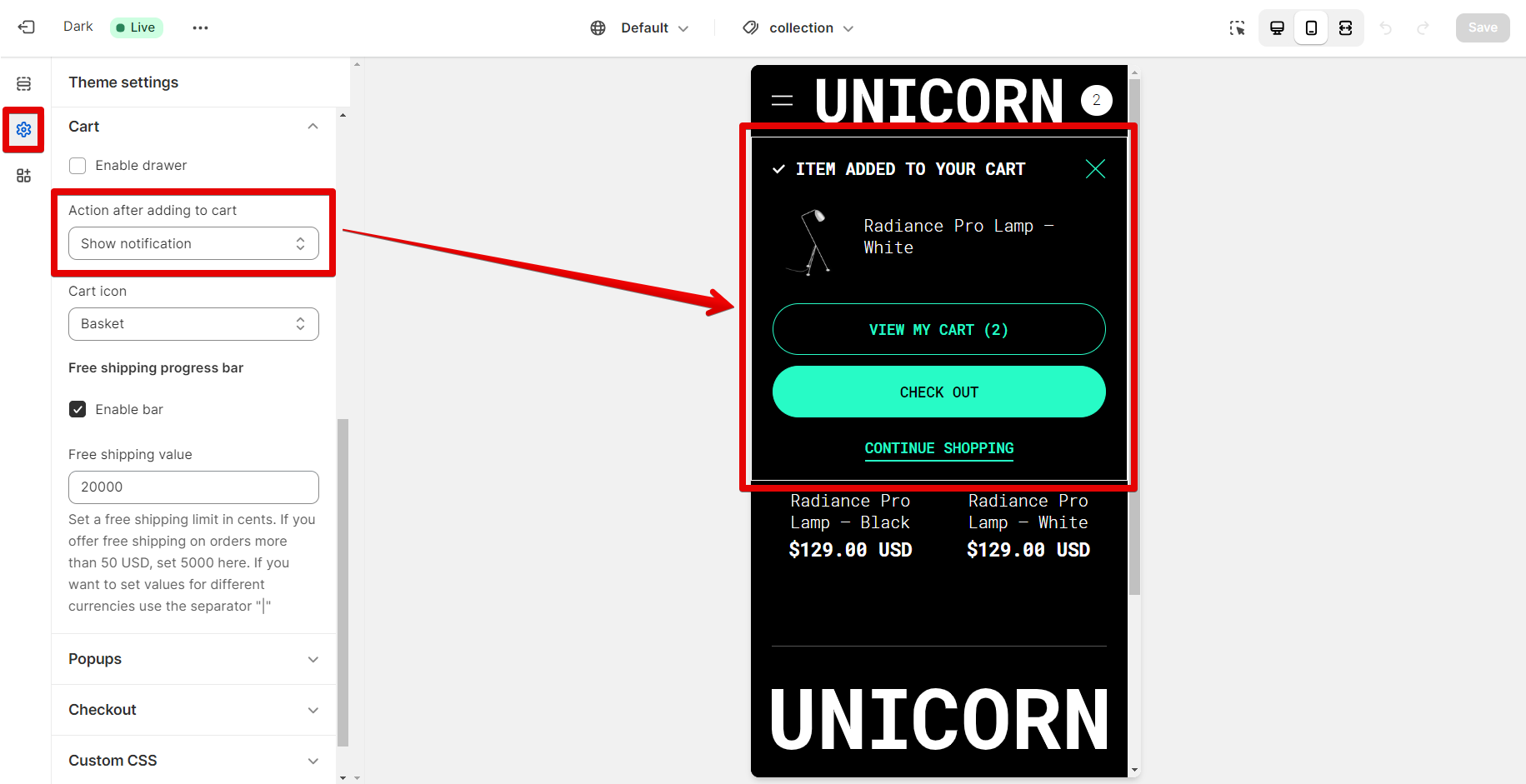
#### **Action after adding to cart**
Use the proper option from the following drop-down list to decide the layout of the Cart pop-up.
Allow customers to view items added to the cart after clicking the "Add to cart" button by activating one of the options described below:
* **"Open drawer"**. This option lets you display a list of items in the cart drawer as a customer adds each following product to the cart.
{% hint style="warning" %}
**Note!** To use the option, add the "[Cart drawer](https://mpithemes.gitbook.io/unicorn-shopify-theme/section-groups/cart-drawer)" section and apply the settings provided within the section.
{% endhint %}
Below, you can see how the cart drawer might be showing on desktop and mobile:
{% tabs %}
{% tab title="Desktop" %}
{% endtab %}
{% tab title="Mobile" %}
{% endtab %}
{% endtabs %}
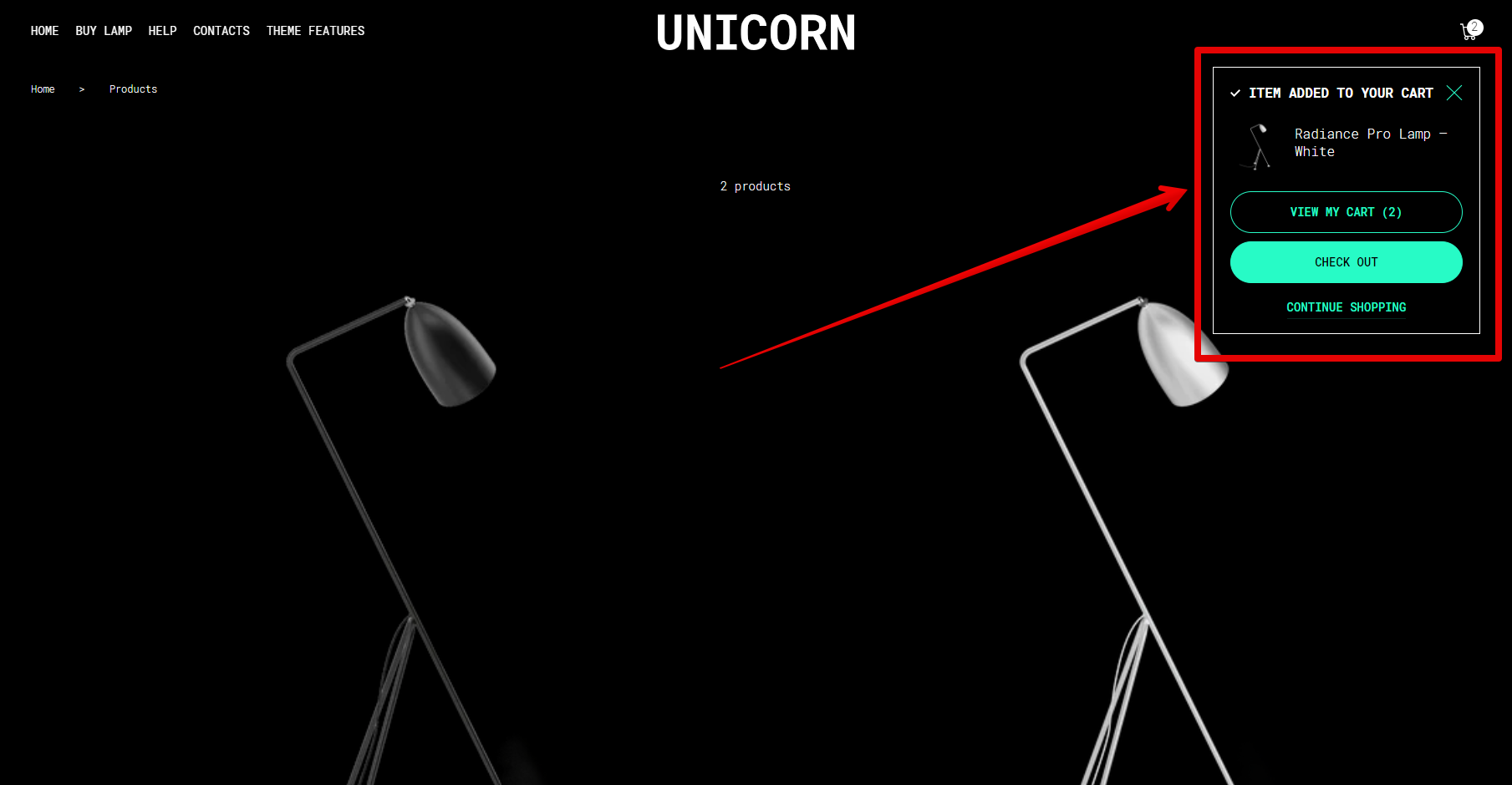
* **Show notification**. If you need to display the cart notification pop-up after pressing the "Add to cart" button, select the provided option. Unlike the cart drawer, this option allows you to display only the last item added to the cart.
Here is how the cart notification is presented in the theme on desktop and mobile:
{% tabs %}
{% tab title="Desktop" %}
{% endtab %}
{% tab title="Mobile" %}
{% endtab %}
{% endtabs %}
* **No action**. This option disables the cart pop-up, which appears when the "Add to cart" button is clicked. Visitors can view the list of added products to the cart after hitting the cart icon in the Header.
{% hint style="warning" %}
**Note!** Using the "Notification" and "No action" options, the response to pressing the cart icon depends on the next settings:
\*Once the "[Cart drawer](https://mpithemes.gitbook.io/unicorn-shopify-theme/section-groups/cart-drawer)" section has been added, the theme will respond by opening the Cart drawer.
\*The customers will be shifted directly to the Cart page when clicking the Cart icon in the Header if the "[Cart drawer](https://mpithemes.gitbook.io/unicorn-shopify-theme/section-groups/cart-drawer)" section is absent.
{% endhint %}
**Cart icon**
The cart icon in the Header and the "Add to cart" button can be changed to "Cart", "Basket", or "Bag" using the following selector.
{% tabs %}
{% tab title="Cart" %}
{% endtab %}
{% tab title="Basket" %}
{% endtab %}
{% tab title="Bag" %}
{% endtab %}
{% endtabs %}
### Free shipping progress bar
**Enable bar**
The Free shipping progress bar will be placed at the top of the Cart drawer, Cart page, and product pages as you enable the checkbox. This option activates the "Free shipping value" input field.
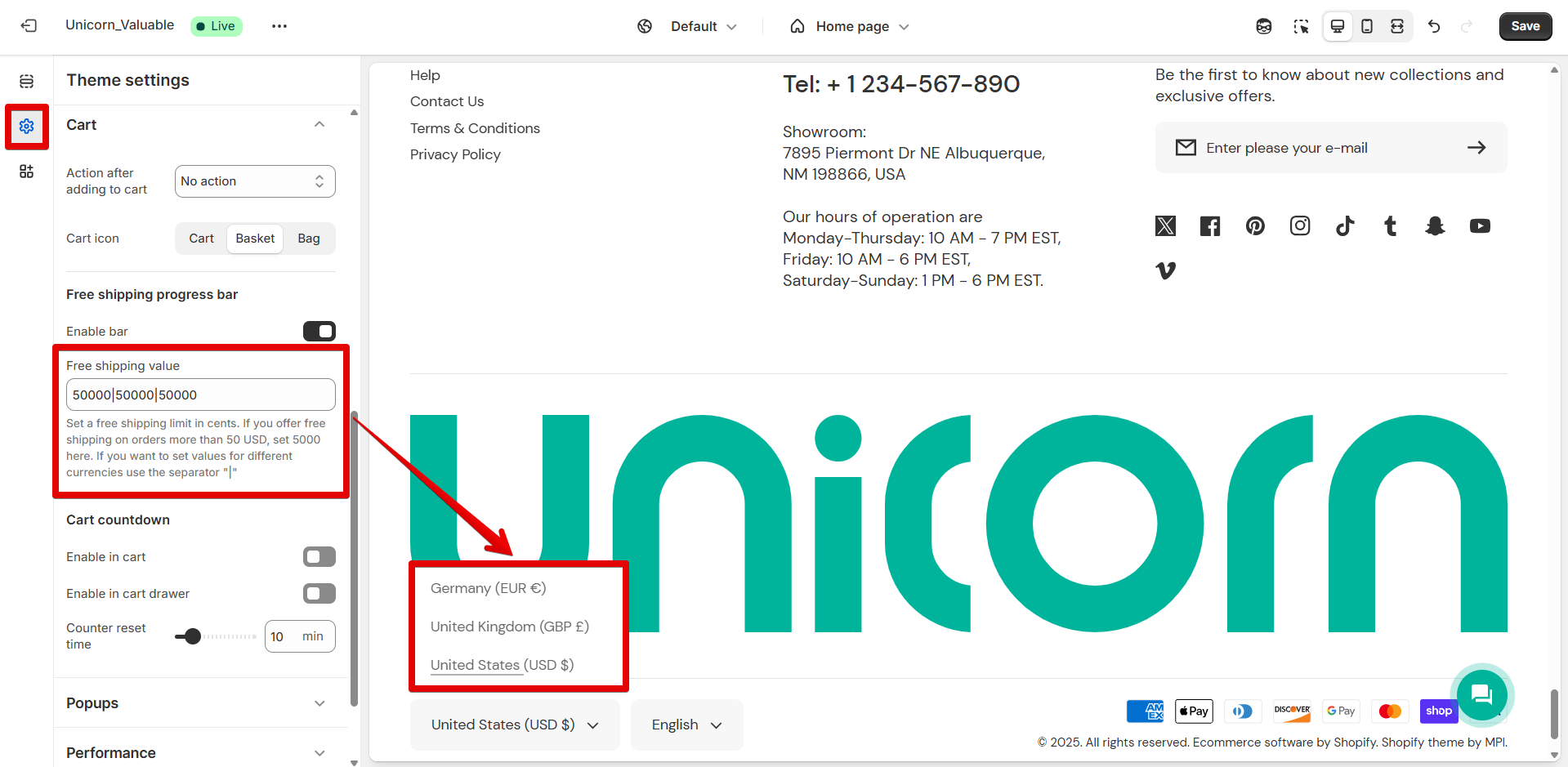
In the **"Free shipping value"** input field, enter the free shipping limit in the format 1 USD = 100 cents.
Eg: 50 USD = 5000 cents, 100 USD = 100000 cents, etc.
If you operate more than one currency in your store, use the "|" as a separator. Add a value for each currency in the same order as displayed in the currency selector.
Change the background color of the Free shipping bar using the **"Background"** palette.
### Cart countdown
**Enable in cart**
Tick the checkbox to place the countdown on the Cart page under the page title. The "Counter reset time" will appear below after enabling the current option.
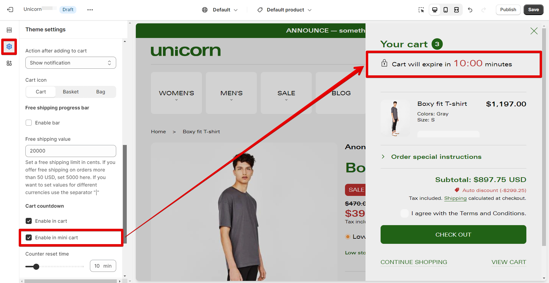
**Enable in cart drawer**
Once checked, a countdown timer will be added to the top of the Cart drawer to indicate when the items are added to the Cart. The "Counter reset time" will appear below after enabling the current option.
**Note!** The feature is not available for the Cart notification pop-up.
The minimal time for displaying items in the cart can be set to 1 minute, and the maximum to 60 minutes using the **"Counter reset time"** slider. Set the desired value according to your needs.